I recently updated my iPhone to Apple’s newly released iOS 18.1. After the install, many (but not all) of my app icons became “dark” as shown in the image below. Why did this happen? How can I restore my icons to their normal appearance?
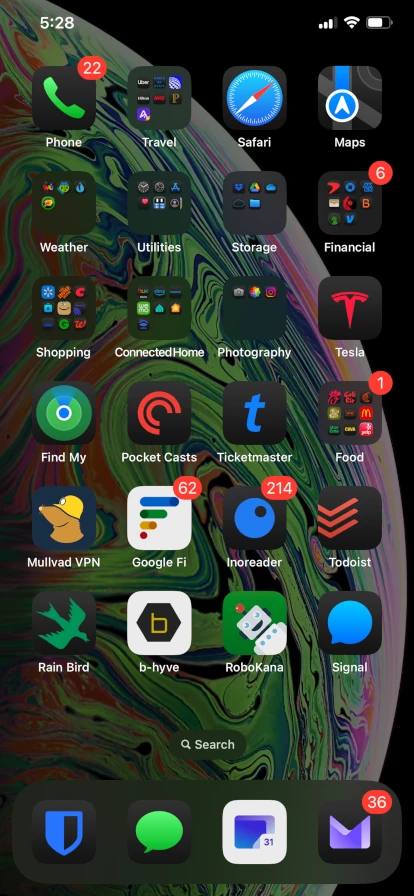
Dark Icons After Update to iOS 18
Apple’s has supported “Dark Mode” for the past several versions of iOS. When Dark Mode is enabled, screen visuals are mostly dark rather than bright. I enable Dark Mode because the dark colors are easier on my eyes (getting old is wonderful except for watching my body parts slowly wear out). To enable Dark Mode on iOS 18, go to “Settings > Display & Brightness” then set Appearance to “Dark”. Your eyes will thank you!
In iOS 17 and earlier, enabling Dark Mode did not change the appearance of app icons. iOS 18 implements a “Dark Icons” feature in which most (but not all) app icons become dark when “Dark Mode” is enabled. This new feature is enabled by default, causing my app icons to turn dark as soon as I installed iOS 18. I spent years learning to quickly recognize my apps by their icons, and now those icons suddenly look different!
I expected to find a setting to enable / disable dark mode icons in “Settings > Display & Brightness”. But the setting is not there.
Here are the steps to enable / disable dark icons:
- Press and hold on an empty area of the screen until all icons start to “jiggle”. Edit and Done buttons appear at the top of the screen.
- Press the “Edit” button in the upper left corner of the screen (hilighted with a red rectangle in the image below).
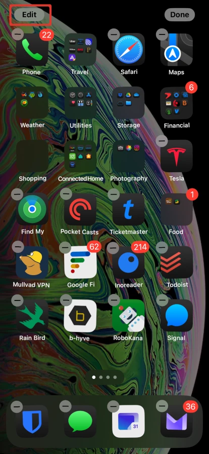
iOS Screen in Edit Mode
- Select “Customize” from the menu that appears when you press “Edit”.
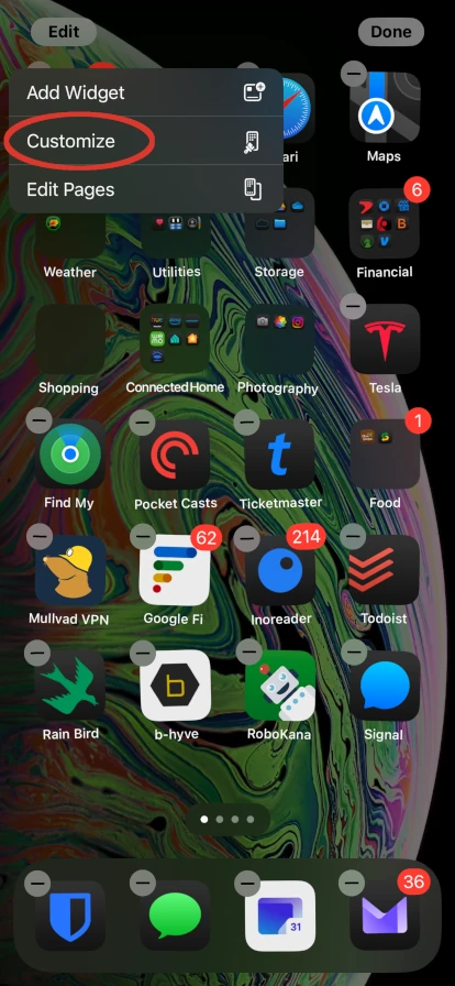
Select Customize from Edit menu
- Several options will appear at the bottom of the screen. These options allow the appearance of app icons to be changed.
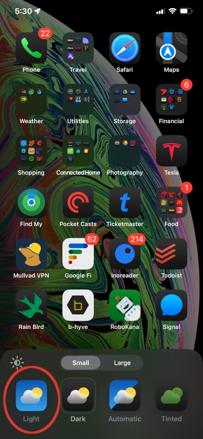
Select Light to Display Icons in Light Mode
- Select “Light” to enable light icons (i.e. to restore icons to their appearance in iOS 17).
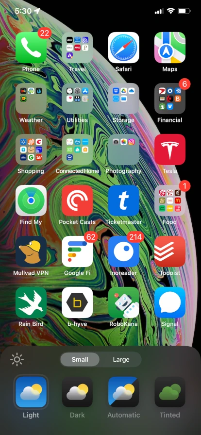
Screen with Light Icons
And now my iOS 18 app icons look the same as they did with iOS 17 (in other words, I have “light” app icons even when I’ve enabled “dark mode”).
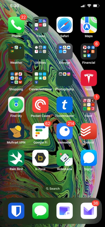
Light Icons with Dark Mode Enabled in iOS 18
Thoughts
Icons visually allow a user to quickly find the application they are looking for. When the appearance of icons changes, a user must relearn the “look” of the icon. I find that with “dark” icons, I no longer quickly recognize icons based on their look.
I turned off dark icons on my iPhone, but have dark icons enabled on my iPad. This is an experiment to see if I get used to them. I do find dark icons slightly easier on my eyes, but the difference in eye strain is minimal. It may be significant for others who have worse eyes. For me, the main value of dark mode is having a dark background versus a bright background. A bright background causes me to squint like I’m staring into a flashlight, while a dark background is easy to look at for long periods of time. I’m struggling to decide whether the slight reduction in eye strain provided by dark icons warrants relearning the look of my app icons.
Rant
I often feel that today software is developed by engineers in their 20s who still have perfectly functional bodies. Please, please please – if you are a 20-something developing a user interface, have mercy on the older folks who will be using your software. Before implementing a new feature that you think looks pretty or cool, get feedback from your grandparents.
A few recommendations:
- Don’t use microscopic fonts that are unreadable by anyone over 30.
- Don’t use interface elements with low contrast. For instance, compare the light and dark icons for Apple Maps. The dark icon has low contrast colors and is (IMHO) much harder to quickly recognize compared to the light icon.
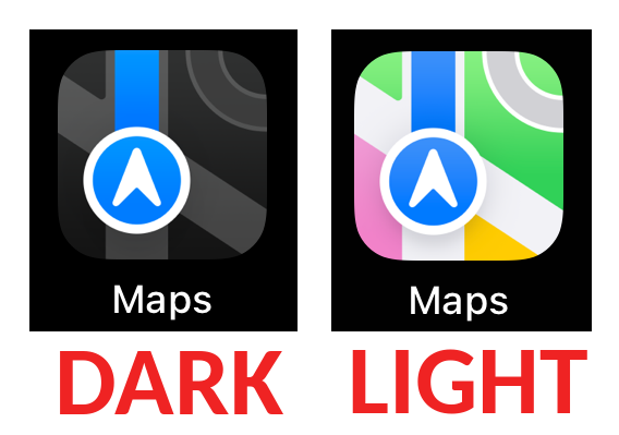
Low Contrast Dark Icon
- Avoid distracting, moving visual elements that are not important to a page’s main content (such as auto-playing, moving ads and images).
- Don’t blast light into peoples eyes. An “uncluttered” bright interface is nice, but support a dark mode so the bright background does not blind old eyes.
- Obey people’s OS/browser preference settings for “light” and “dark” modes. This blog displays in either a light or dark mode depending on your browser setting.
- Don’t force unnecessary interface changes on users. Should dark mode icons have been the default for people who already had “dark appearance” enabled? Maybe, but I don’t think so. Since they are the new default, put the setting to disable them in the same place that “dark appearance” can be enabled or disabled. And listen to your grandmother when she complains that she can’t find her apps anymore because all her icons look different in iOS 18!
Why Do Some App Icons Remain Light?
In the dark screen shown above, the icons for “Google Fi”1 and for “b-hyve”2 still have light backgrounds.
An app developer provides an app icon along with the rest of their app. Some developers have not yet updated their apps to provide both light and dark mode icons for iOS 18. Over time I expect all apps will provide dark mode icons.
Hope this info was helpful – thanks for reading!
